 Risk analysis tends to be a highly mathematically, statistically, and let alone probabilistically oriented science. Risk maps derived from risk analysis often portray only one possible scenario and do not leave much room for personal interpretation. Data on risks and hazards often tend to be heterogeneous, complex, inter-dependent, not directly comparable, and correlated in ways that are not immediately apparent. Visualization technology has emerged as a form of exploratory cartography, which can help explain, analyze and communicate risk. Because the risk analyst and the public in general may differ on what constitutes a risk or what not, visualization techniques can help the risk assessor better understand underlying factors and generate better risk maps, thus communicating a clearer message to the public. Examples of how risk should be communicated are presented and discussed along with current visualizations.
Introduction
We live in an advanced and seemingly peaceful society. We have tamed nature the best we can, but natural disasters still happen. We are surrounded by state-of-the-art safety technology, but major accidents still happen.
The ever increasing complexity of today’s modern society, coupled with its interwoven and interdependent technological infrastructure, where even a small-scale man-made or natural disaster can affect much more than just the immediate vicinity of the disaster, has given rise to the field of risk assessment, aimed at quantifying risks and their probability, and thus managing risks.
General use of risk assessment can provide a basis for preventing and limiting the consequences of accidents, thus enabling the risks to be dealt with in a coherent way (DCDEP, 2000). This is also supported by the United Nations Environment Program APELL (Awareness and Preparedness for Emergencies at the Local Level), which lists the identification of risks that can pose a potential threat as one of its main goals. Similarly, FEMA (FEMA, 2001) has its PROJECT IMPACT, aimed at building disaster-resistant communities. In order to gain better preparedness for disasters, possible risks must be identified. Visualization may here provide a valuable tool for both identifying, exploring and communicating risks.
Geographic visualization has emerged as a tool for searching through huge volumes of data, for communicating complex patterns, for providing a formal framework for data presentation, and for exploratory analysis of data (Gahegan, 2000). Data on risks and hazards often tend to heterogeneous, complex, inter-dependent, not directly comparable, and correlated in ways that may not be apparent without the use of visualization technology. In a paper on the use of GIS to assess natural hazards, Coppock (1995) noted visualization as important not only in the development of GIS generally, but also as a tool to improve reliability of hazard assessment, thus decision support, and also to improve the ability of non-experts to take advantage of the information presented. A statement on the need to improve the representation of risk and vulnerability is also found in Radke et al. (2000), noting that the average GIS is not able to represent the depth and richness of the dynamic nature of risk and vulnerability.
This paper will address the issue of visualization as a means of risk communication as well as risk exploration, highlighting the different approaches that need to be used in explorative visualization versus communicative visualization.
Risk and vulnerability
Objective versus perceived risk
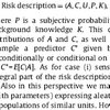
In its simplest form risk may be seen as the product of probability and consequence.
R = P x C (Risk = Probability x Consequence)
In this sense, both high-probability low-consequence incidents and low-probability high-consequence incidents may have the same risk value: It is quite probable that I may stumble and fall when walking along a forest trail; the consequences in most cases are minor. It is much less probable that I will be hit by a falling tree when walking the same trail; the consequences however may be dire. Even though the objective risk numbers may be the same, we humans will rank one risk above the other. Which is the greater risk?
This makes it clear that in dealing with risk, it is often necessary to distinguish between objective risk and perceived risk. Objective risk is a measure of the scientifically quantifiable risk, often derived from probability calculations. Perceived risk is a measure of the imminent danger a person feels he or she is in. Perceived risk can also be a measure of what consequences the individual person is willing to accept before he or she considers a probable incident to be a risk.
Vulnerability
Risk often pertains to a factual event; vulnerability often pertains to a system, such as power supply, telecommunications, infrastructure or society as a whole. Vulnerability is a measure of how well a system can cope with or sustain a risk. The average risk of a long-term power outage may be relatively small in our modern world, except for example during severe winter storms. Yet, even though the risk is minor, the vulnerability is extremely high. This makes it eminent that any risk needs to be linked to its consequences to have a meaning. Consequences in narrative form are one form of “visualization”. Since vision is the dominant sense in sighted humans (Gahegan, 2000), a visual presentation of consequences will often generate a better insight.
Risk experts versus public opinion
It may seem oversimplified to phrase it this way, but one could say that the risk expert is mainly concerned with finding the quantitative risk, that can be stated in mathematical figures, because that is what most technological decisions are based on. The general public or the individual person on the other hand is more concerned with the qualitative risk that affects him or her personally. Consequently, the communication of risk becomes either an obstacle for widening or a bridge for closing this gap between the expert and the layperson. Risk visualization can play a major part in doing so.
Risk communication
As a consequence of the understanding about the divergence in perceptions of risk between the public and the experts, and the ensuing debate over the acceptability of such risks, a whole new area of study has developed, called risk communication. Risk communication is the process of developing and delivering a message from the risk expert to the general public (Cutter, 1993). This process may be aimed at communicating about the danger in a pending emergency or in general to inform about the risk in an issue that the public may or may not perceive differently from the experts.
Risk visualization can, in fact, be viewed as one form of risk communication, which can be further separated into explorative visualization and communicative visualization. The first approach emphasizes exploration, meant to study and to analyze phenomena or events that can be considered a risk, the latter emphasizes communication, meant to inform and to raise awareness among the public in general.
One of the main issues that needs to be addressed in risk communication is the question of how to communicate risk and the question of to whom the communication is directed. Going further into area of risk communication will be beyond the scope of this paper; readers are referred to Lundgren (1994) or Gutteling et al. (1996) for further study.
Issues in visualization of risk
Visualization versus cartography
Visualization of spatial data has close links with cartography. Cartography is the art or science of making maps (Webster) or the art and science of graphically representing a geographical area, usually on a flat surface such as a map or chart; it may involve the superimposition of political, cultural, or other nongeographical divisions onto the representation of a geographical area. Cartography is an ancient discipline that dates from the prehistoric depiction of hunting and fishing territories (www.britannica.com).
Maps have been used for centuries to visualize spatial data. They help their users to better understand spatial relationships. From maps, information on distances, directions and area sizes can be retrieved, patterns revealed and relations understood. (Kraak and Ormeling, 1996)
Past presentation-oriented cartographic research has emphasized the use of static maps designed for public consumption with the emphasis on extracting specific pieces of information (MacEachren and Kraak, 1997). Visualization, which has emerged and gained momentum during the last decade, is less concerned with presentation created by a supposed expert, and more concerned with exploration by the individual.
MacEachren (1994) introduced a map-use based approach to visualization, presented as a cube, which was later modified together with Kraak (MacEachren and Kraak, 1997), see figure.

Goals of map use. Sequence of goals that can be facilitated by visualization methods are arrayed in a map-use cube. From: MacEachren and Kraak, (1997).
Exploration versus communication
Even though this map-use cube identifies 4 speparated stages in visualization, it may be better to see visualization as a continuuum ranging from exploration, that is looking at the data, via analysis, that is discovering hidden relationships, to presentation, that is communicating one or more realizations of the data.
As mentioned above, past communication-oriented cartographic research has emphasized the use of static maps designed for public consumption with the emphasis on extracting specific pieces of information (MacEachren and Kraak, 1997). Unfortunately this still holds true in the realm of risk mapping, where the lay user of the map has to rely on the information that the risk expert chooses to put on the map. With little or no understanding of how the map was derived or how to interpret it properly, risk perception becomes a highly personal matter.
Uncertainty
The very word risk implies uncertainty. Conversely, if there exists an uncertainty whether a hazard exists, there remains a probability that it does and therefore there exists a risk. Quantitative analysis of uncertainty and variability is receiving growing acceptance in risk acceptance. Thus, it is the responsibility of the risk assessor to use whatever information us available to obtain a number between zero and one for a risk estimate, with as much precision as possible, together with an estimate of the imprecision. (Wilson and Shylakter, 1997)
Davis and Keller (1997) explore the modeling and visualization of multiple spatial uncertainties, using slope stability and landslide susceptibility. Davis and Keller argue for a dynamic, rather than static display, because an important aspect of visualizing uncertainty should be the ability to view the various realizations rather than the parameters. This is particularly true when viewing the results of a process model. The static display of standard deviation values would be of little use to decision makers. Visualizing the implications of variance is far more important. This has direct bearings to risk visualization where one static display of a certain set of parameters does not give a full picture of the variability in the data. In lay terms, exploring different combinations of risk related to the certainty of the derived risk may give a different view than the risk value alone. If the risk is high, but its certainty is low, then is the risk actually high or is it not?
A similar approach can be discerned in Ehlschlaeger et al. (1997), where uncertainty in elevation data creates a number of diverging realizations of a possible corridor between two locations. Using the analogy of corridor analysis, and substituting the elevation surface with a risk surface, this could be applied to road design in finding the least hazardous path over a given terrain, avoiding terrain with a high potential for wildfires, landslides, flash flooding in gullies, or analyzing an existing right-of-way corridor with relation to its hazard potential.
Correlation
Tobler (1979) championed the phrase “everything is related to everything else, but near things are more related than distant things”. One way of visualizing this is through scatterplots. Scatterplots are perhaps the most well-known visualization technique for exploring spatial relationships Gahegan (2000), as well as dependency between variables in a risk analysis (Vose, 1997). The major difference between the two is that while risk analysts and statisticians confine themselves to investigating the dependencies between two variables, spatial analysts using visualization techniques can work in 3 or more dimensions:

Display of spectral training data from classification exercise using remotely-sensed imagery. From: Gahegan (2000)
In general, the scatterplot is often used to graph variables directly against each other, effectively removing locational information. In this way, the data is transformed from its spatial reference to an arbitrary non-spatial scale, devised by the user (Gahegan, 2000). With the spatial dimension removed, the viewer can focus on examining the relationships independent of the location.
Cartographic methods
For detailed descriptions on which cartographic techniques that are most appropriate, the reader is referred to Bertin (1993), MacEachren (1995) and Ormeling and Kraak (1996) to mention but a few.
In this paper, it will have to suffice to point out some important issues. Figure 3.3 shows nine possible map types for displaying the same data. Which one that is most suitable for risk mapping, is difficult to tell, that will depend both on the risk data itself and the way the risk assessor would want it to be displayed. In general though, it must be warned against using choropleth maps that distribute a risk evenly over a surface when the risk in fact is not homogenous to such an extreme degree that it follows the choropleth boundaries.

Transformation in maps
Transformation possibilities among maps. From: Ormeling and Kraak (1996)
One example of such misleading risk mapping can be seen in the FEMA’s HAZUS maps (Fig. below). Here, the user can select a hazard and calculate his or her own damage estimation. Since this estimation is based on census data, it naturally follows the census tracts. In the figure, ground acceleration during an earthquake is used to calculate potential damage, and assumed to be uniform over the whole census tract, in order to generate a damage estimate. Not only may this confound the ignorant user of this map, it clearly distorts the factual damage.

Excerpt from map output from HAZUS, showing damage estimate based on ground acceleration during an earthquake (Courtesy of Lorraine Nelms)
More persuasive are the ground-shaking intensity maps developed by Perkins (1987) in the late 1970s, and described in Monmonier (1997). On Shaky Ground (Perkins, 1987) includes risk maps for three types of construction and the potential accumulated damage associated with each building type for a given area. Even though the maps contain no information on existing land use, they are much easier to read and understand than the map in figure above.
Examples of visualization of risk
Risk analysts are experts in their particular field, and exceptions granted, not necessarily educated in cartography or visualization techniques, given their preoccupation with mathematical calculable deterministic or probabilistic models. Consequently, their rendering of spatially related risk may be inflicted with serious flaws.
This chapter does not attempt to provide an exhaustive overview of “good” or “bad” examples of risk mapping. Even Monmonier (1997) only scratches the surface, but supplies enough examples to raise a few eyebrows. Here Monmonier looks at how well America maps its natural, technological, and social hazards, concluding that hazard maps not only show how well we understand hazards, but more often, how little we understand of hazards. The interested reader is referred to this literature for wider and more conclusive study on risk mapping and visualization.
The following is thus more a supplement to Monmonier than a separate collection of examples. Looking back at what has been stated on visualization in the previous chapter, it is left up to the reader to decide for themselves whether these are good visualizations or not.
Drought
Predicting a wildland fire season is difficult, at best. And the earlier a fire season is forecast, the more unknowns there are. For example, how much or how often rain will fall in the spring may mean the difference between few small fires or many large ones. Still, weather patterns and fuel conditions can be important indicators of the potential for a busy, or slow, fire season.
The Climate Prediction Center, CPC, together with the U.S. Department of Agriculture and the National Drought Mitigation Center in Lincoln, Nebraska, issues a weekly drought assessment called the U.S. Drought Monitor. The Monitor provides a consolidated depiction of national drought conditions based on a combination of drought indicators and field reports. Not only indicative of wildfire risk, it presents a general overview of the situation related to drought, making potential drought- related risks apparent.

This map shows levels of concern about wildfire in Utah, ranging from low (green) to high (red) based on a combination of population density, past fire occurence and vegetation. Source: Utah Bureau of Land Management.

This figure shows the same image as above, but in a grayscale. Note that the dark green areas are no longer discernible from the red or orange areas.
Wildland fire
In order to ensure that visualization achieves its goal, the data should be encoded to the available visual attributes bearing in mind the perceptibility of the attributes (Gahegan, 2000). This is especially true in communicating risks. For example, classifying danger zones was red and safe zones as green poses a challenge for red-green color-blind persons. Color graduation yellow-orange-red is preferred and still discernible even in a black-and-white (grayscale) photocopy.
Aggregated risk in small-scale maps
This figure shows a map depicting the overall catastrophic risk in the United States. No information is given how the risk index is derived or how it is aggregated. Nonetheless, it still indicates which is the dominating risk in the given region.

Evaluation and conclusion
As Molak (1997) points out, earlier forms of risk analysis and risk communication tended to overemphasize the role of the expert in “proving that something is NOT dangerous”. However, as he states further, the most important issue is to always make risk assessment transparent to the public with all the assumptions and parameters clearly stated. The thought process that goes into evaluating a particular hazard is more important than the application of some sophisticated mathematical technique or formula, which often may be based on erroneous assumptions or models of the world. Visualization is an excellent tool to overcome these limitations, because it stimulates thought and because it can be used to display uncertainties and the variability of the parameters that influence risk.
In all this praise for explorative visualization, one should not overlook the limitations of this technology, as Gahegan (1999) remarks and Uhlenküken et al. (2000) give excellent examples of. No visualization can overcome the deficiencies in the data or deficiencies in the software itself. What lacks most is the interoperability of systems for scientific visualization, image processing, GIS, database engineering, statistical analysis and other methodology.
Explorative visualization should be the main impetus for the risk analyst, in an attempt not to just to quantify the risk best possible, but to identify correlations, uncertainties and hidden information. Decision-making based on risk assessment does not rest on a crisp finite analysis, but on an evaluation of all contributing factors and uncertainties.
Future outlook
In the search for relevant applications of visualization techniques for risk analysis, it was discovered that most literature, with a few notable exceptions, only employs static 2D techniques, maybe covering a few variations of risk factors at the best. Risk analysis seems preoccupied with numbers rather than figures, more concerned with modeling risk accurately than allowing room for uncertainty and exploration. Unfortunately, this seems to be the nature of risk analysis; in the end, the public wants certainty whether there exists a risk or not, vagueness does not seem to be an option here.
Risk analysis is a crucial element in emergency preparedness. Visualization is one methodology that should be part of risk analysis. Visualization is closely linked to GIS. The number of limitations, challenges and possible improvements in GIS with respect to using it in emergency preparedness, as highlighted by Radke et al. (2000), can serve not only as a guideline for future GIS research for emergency preparedness, but also point to rewarding research avenues for visualization of risk and vulnerability.
In conclusion, it is hoped that visualization techniques find their way into risk analysis, thus not only enhancing, but also de-mystifying the number-and-probability-crunching that is currently prevailing. As this paper has shown, the potential for improvement is fairly large; something this author definitely aims at contributing his share to.
References
Alexander, D., 1995, A survey of the field of natural hazards and disaster studies, In: Carrara, A. and Guzzetti, F. (Editors), Geographical Information Systems in Assessing Natural Hazards, Kluwer Academic Publishers, Dordrecht, The Netherlands, 1-19.
APELL, 1999, United Nations Program on Awareness and Preparedness for Emergencies at Local Level, http://www.unepie.org/apell/
Bertin, J., 1983, Semiology of graphics, University of Wisconsin Press, Madison, WI
Coppock, J. T., 1995, GIS and natural hazards: An overview from a GIS perspective, In: Carrara, A. and Guzzetti, F. (Editors), Geographical Information Systems in Assessing Natural Hazards, Kluwer Academic Publishers, Dordrecht, The Netherlands, 21-34.
Cutter, S. L., 1993, Living with risk, Routledge, Chapman and Hall Inc., New York, 215p
Davis, T. J. and Keller, P., 1997, Modelling and visualizing spatial uncertainties, Computers and geosciences (special issue), 23, 4, 397-408
DCDEP, 2000, Risk Assessment in Europe, A summary of the EU workshop on Risk Assessment, Oslo, Norway, 25-26 November 1999, published by the Directorate for Civil Defense and Emergency Planning (DCDEP), Norway, http://www.beredskapsnett.no
Ehlschlaeger, C. R., Shortridge, A. M. and Goodchild, M. F., 1997, Visualizing spatial data uncertainty using animation, Computers and geosciences (special issue), 23, 4, 387-395
FEMA, 2001, Project Impact, http://www.fema.gov/impact/impact00.htm
Fuhrmann, S., Kuhn, W. and Streit, U. (Editors), 2000, Geoscientific Visualization, Computers and Geosciences (special issue), 26, 1
Gahegan, M., 1999, Four barriers to the development of effective exploratory visualisation tools for the geosciences, IJGIS, 13, 4
Gahegan, M., 2000, Visualization as a tool for geocomputation, in: Openshaw, S., and Abrahart, R.J. (Editors) Geocomputation, Taylor and Francis, London, 253-274
Gutteling, J. M. and Wiegman, O., 1996, Exploring Risk Communication, Kluwer Academic Publishers, Dordrecht, The Netherlands, 221p.
International Cartographic Association (ICA), 2001, Commission on Visualization and Virtual Environments, http://www.geovista.psu.edu/icavis/index.html
Kraak, M. J. and Ormeling, F. J., 1996, Cartography: Visualization of spatial data, Addison Wesley Longman Ltd., Harlow, England, 222p.
Lavakare, A., unknown, GIS and risk assessment, In: www.gisdevelopment.net
Lundgren, R., 1994, Risk communication: A handbook for communicating environmental, safety and health risks, Battelle Press, Columbus, Ohio, 176p.
MacEachren, A. M., 1994, Visualization in Modern Cartography, Pergamon Press, London, 345p.
MacEachren, A. M., 1995, How maps work: representation, visualization, and design, Guilford Press, New York, 513p.
MacEachren, A. M. and Kraak, M. J., 1997, Exploratory cartographic visualization: advancing the agenda, Computers and geosciences (special issue), 23, 4, 335-343
Miller, H., 2001, Geographic Visualization, Lecture notes from 6010 Geocomputation, University of Utah, spring semester 2001
Molak, V., 1997, Introduction and overview. In: Molak, V. (Editor), Fundamentals of risk analysis and risk management, CRC Press Inc., Boca Rotan, Florida, 1-10.
Monmonier, M., 1996 How to lie with maps, University of Chicago Press, 207p
Monmonier, M., 1997 Cartographies of danger, University of Chicago Press, 378p
Perkins, J. B., 1987, The San Francisco Bay Area – On Shaky Ground, Association of Bay Area Governments, Oakland, CA
Radke, J., Cova, T. J., Sheridan, M. F., Troy, A., Lan, M., Johnson, R., 2000, Application challenges for geographic information science: implications for research, education, and policy for emergency preparedness and response, URISA Journal, 12, 4
Slovic, P., 1997, Risk perception and trust. In: Molak, V. (Editor), Fundamentals of risk analysis and risk management, CRC Press Inc., Boca Rotan, Florida, 233-246.
Tobler, W. R., (1979). Cellular Geography, D. Reidel Publushing Company, 379-386
Uhlenküken, C., Schmidt, B. and Streit, U., 2000, Visual exploration of high-dimensional spatial data: requirements and deficits, Computers and Geosciences, 26, 1.
Vose, D., 1997, Monte Carlo Risk Analysis Modeling. In: Molak, V. (Editor), Fundamentals of risk analysis and risk management, CRC Press Inc., Boca Rotan, Florida, 45-66.
Wilson, R. and Shlyakter, A., 1997, Uncertainty and variability in risk analysis. In: Molak, V. (Editor), Fundamentals of risk analysis and risk management, CRC Press Inc., Boca Rotan, Florida, 33-43.
Reference
Husdal, J. (2001). Can it really be that dangerous? Issues in visualization of risk and vulnerability. Unpublished working paper. University of Utah, Salt Lake City, USA.
Related
- husdal.com: The use of air photos in emergency management